Company
Breezy Seguros
Year
2025

" I had the privilege of working with Felipe as our UX Designer, and I can confidently say he is one of the most talented and thoughtful professionals I’ve ever collaborated with. Felipe combines creative vision with a user-centered mindset to build exceptional digital experiences. His ability to translate complex ideas into intuitive, elegant interfaces was instrumental in shaping several of our key products. Beyond his technical skill, Felipe brings a positive, collaborative energy to any team he’s the kind of person who elevates everyone around him. Any company would be lucky to have him. I wholeheartedly recommend Felipe for any role that values innovation, empathy, and design excellence. "

Eucimar Raposo
Breezy Seguros is an independent insurance brokerage built on technology, focused on serving the Latino community in the United States. Its offering was innovative, but it lacked a digital presence to support it.
Customers had no portal. Certificate requests, insurance claims, and quotes went through WhatsApp and email. This led to queues, miscommunication, and a loss of trust right after buying a policy, when customers most need to feel secure.
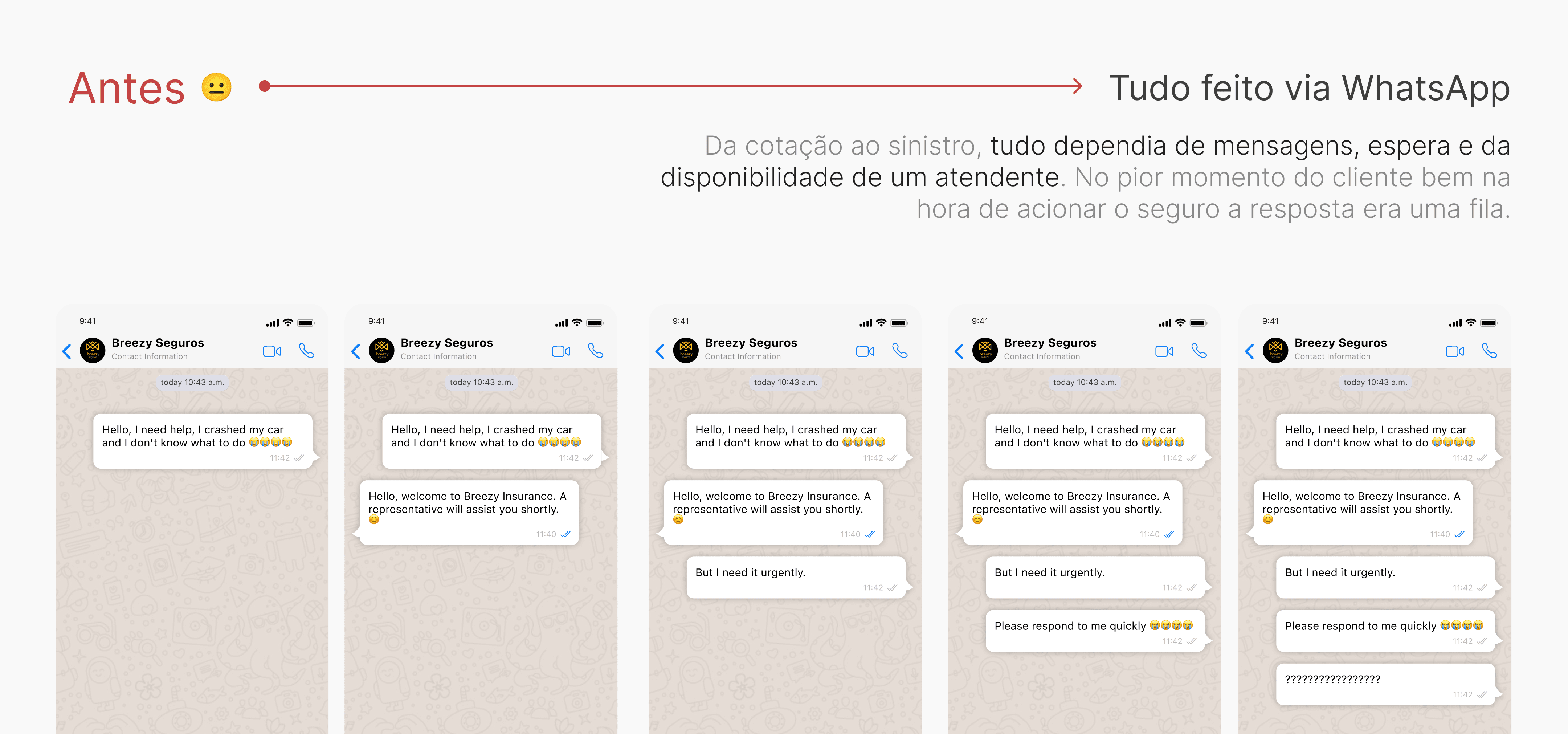
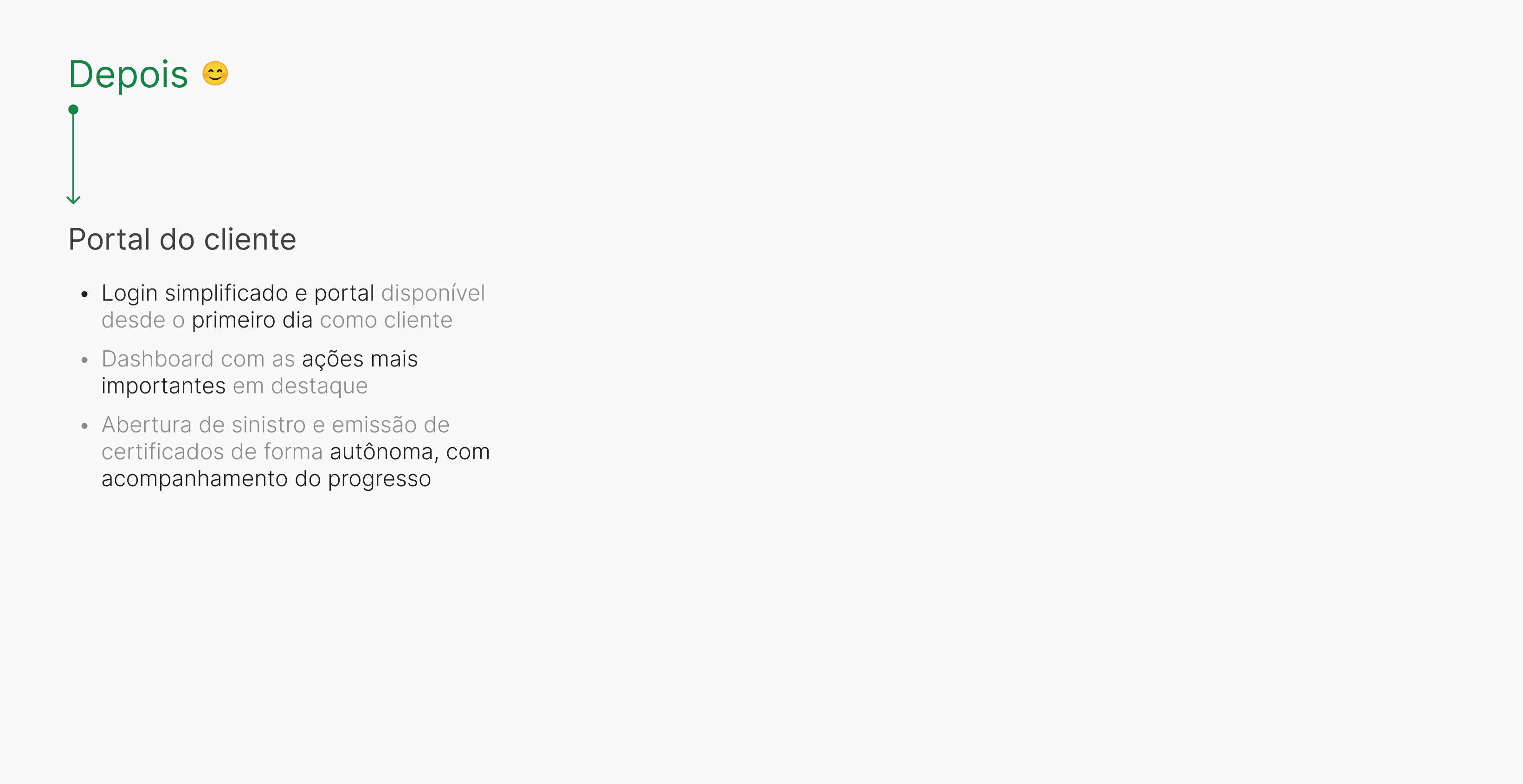
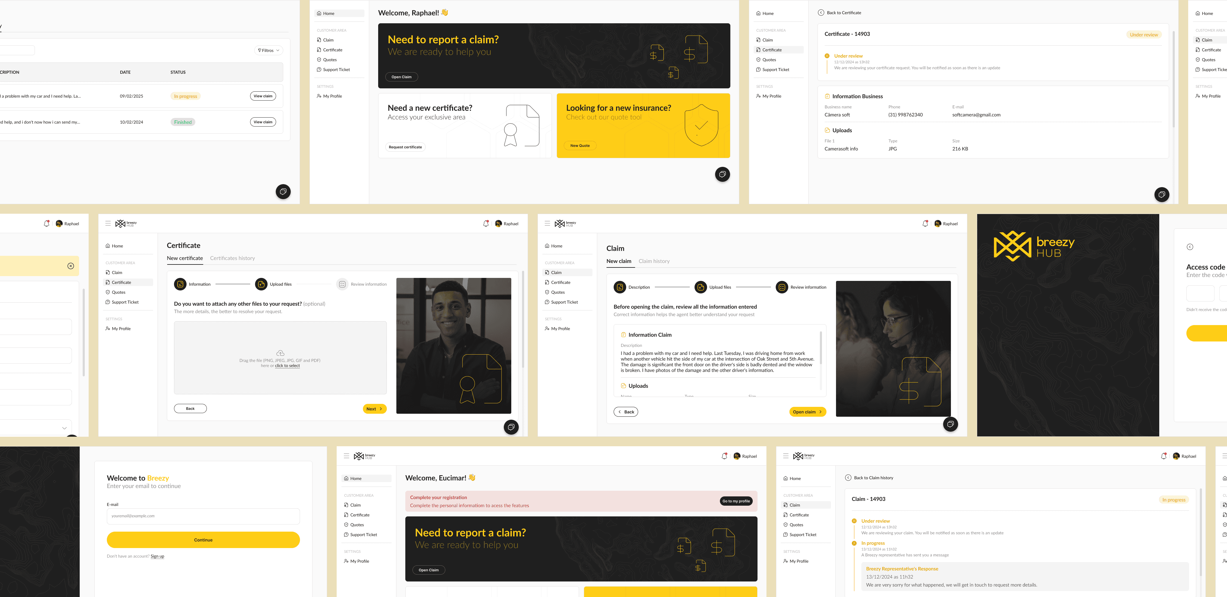
Create a simple, reliable, and efficient portal that brought all customer interactions with Breezy into one place, reducing reliance on support and restoring a sense of security. It needed to give customers control and scale to support new ways of interacting with them.
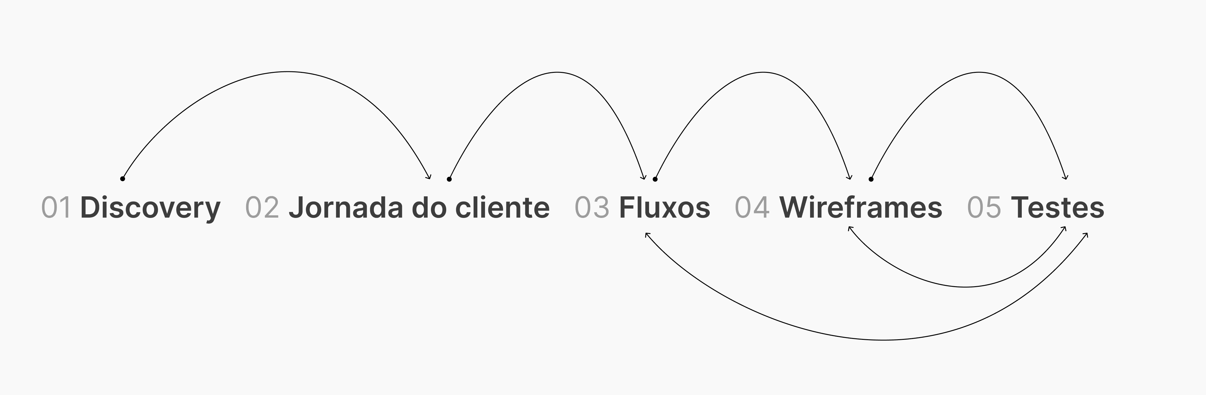
Before designing any screens, we followed a structured process, from listening to validation, to make sure we were solving the right problem, rather than just creating an attractive interface.
In the next sections, I walk through each stage: discovery with internal teams (CX, support, and retention), customer interviews, journey mapping, flows and wireframes, and finally validation with stakeholders and real users.
The approach was simple: first listen to the teams dealing with the problem every day, then check with the customers experiencing it, and only then start designing.
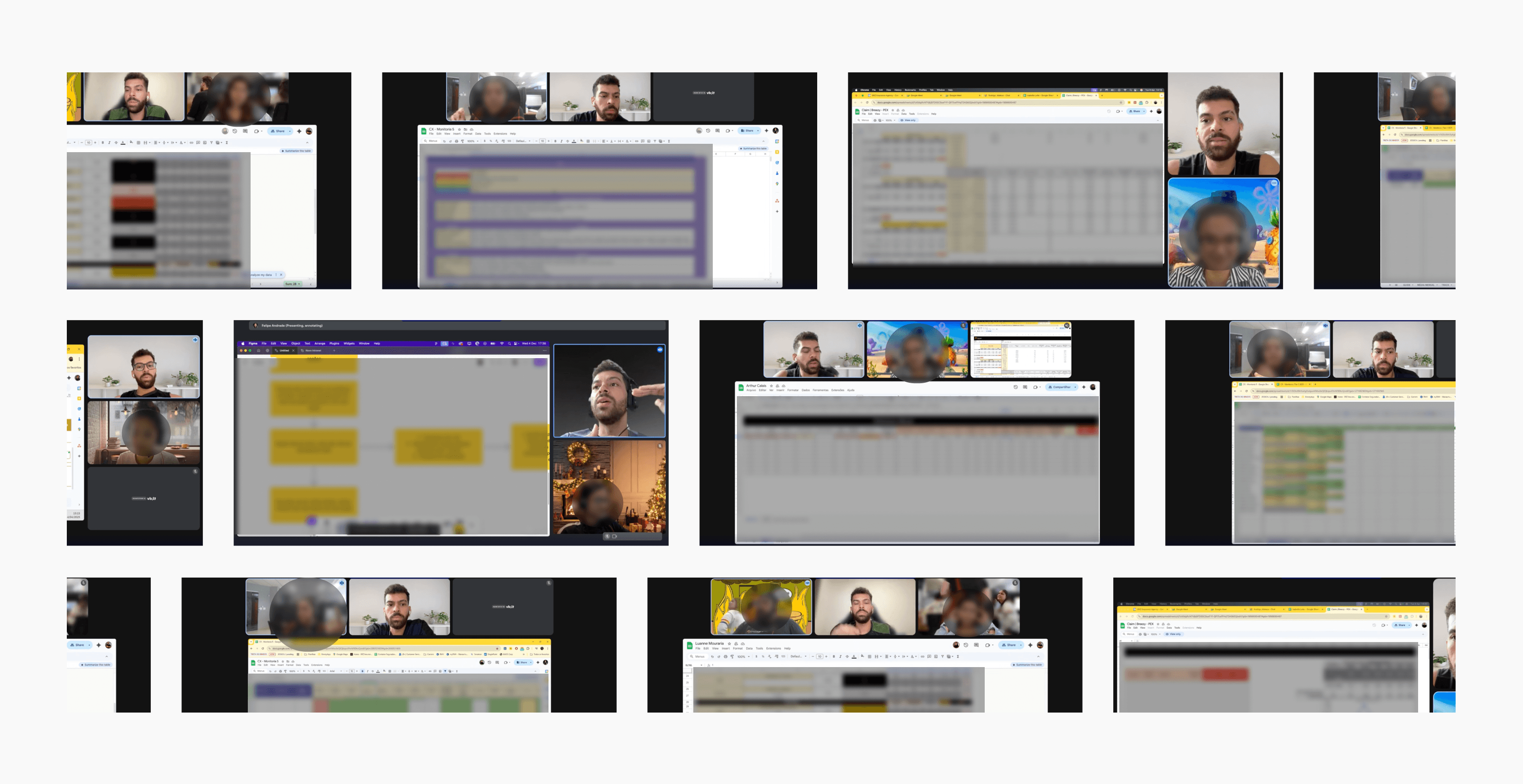
We started discovery where the problem was: with the CX, support, and retention teams, who were in constant contact with customers through WhatsApp and email. We conducted more than 20 interviews, with these goals:
Find the most common patterns in customer conversations
Review internal documents about processes
Identify the biggest points of friction between customers and the company
Identify why customers were leaving
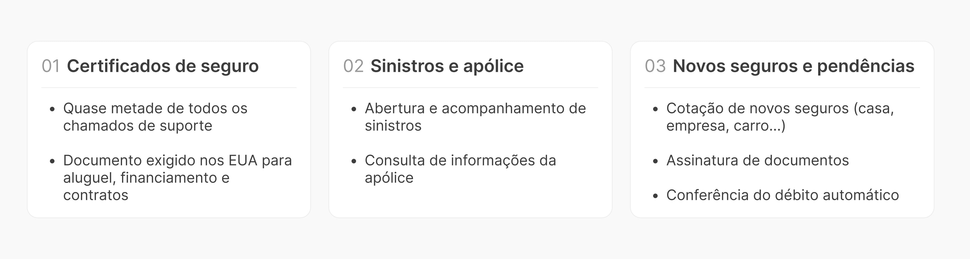
After the interviews, document review, and analysis of each team’s conversation history, we identified the patterns we were looking for. Nearly everything fell into three main categories, from most to least common:
We spoke with more than 15 customers to understand their experience with Breezy. Their concerns were almost always about feeling secure and knowing what to expect:
If I ever need to file a claim, will everything go smoothly?
How can I track the progress of a claim?
How long does it take after I file a claim?
Are my payments being debited correctly?
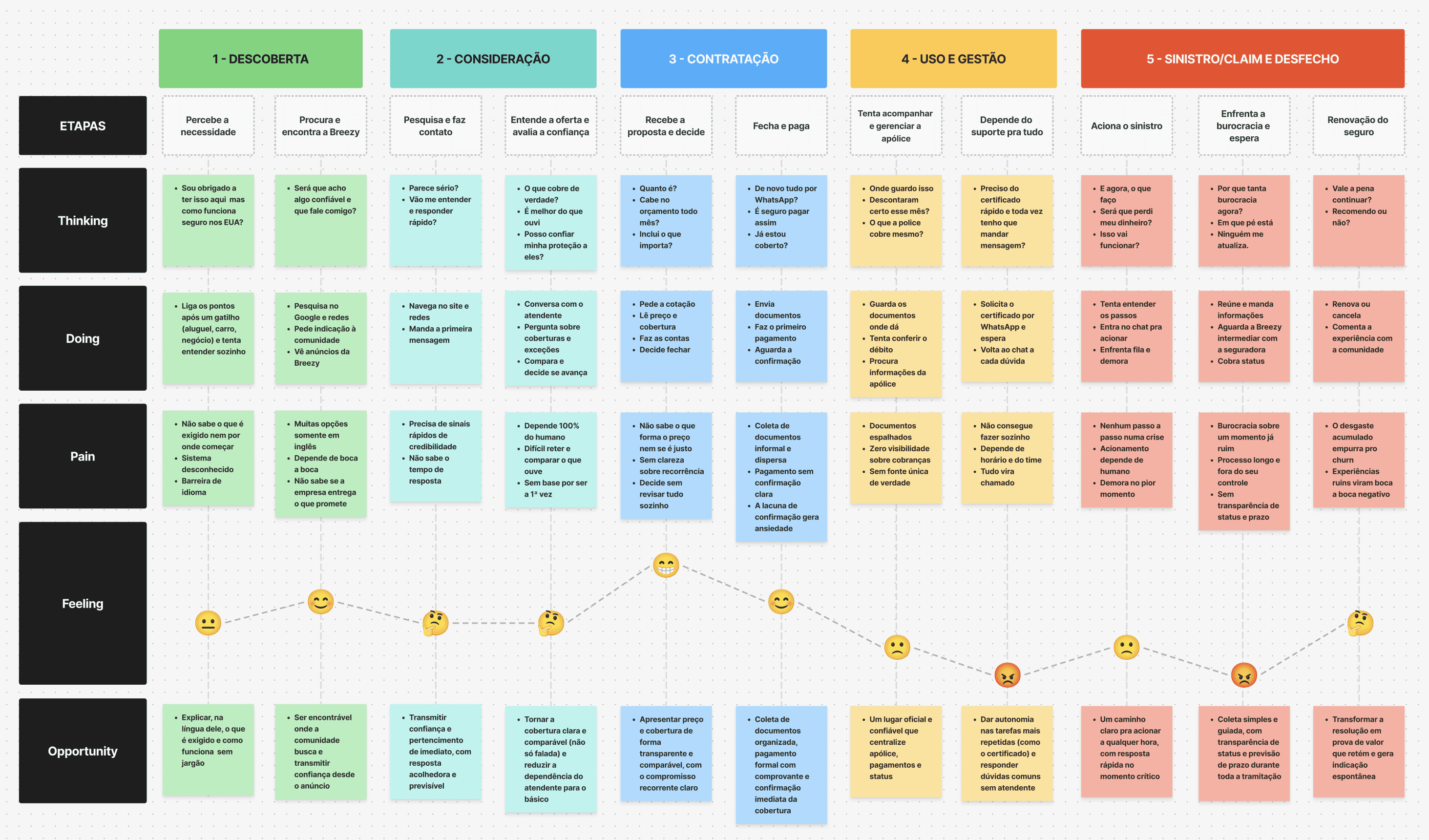
Combining internal discovery with customer conversations, I documented the end-to-end journey: Discovery → Consideration → Policy purchase → Use and management → Claim and outcome.
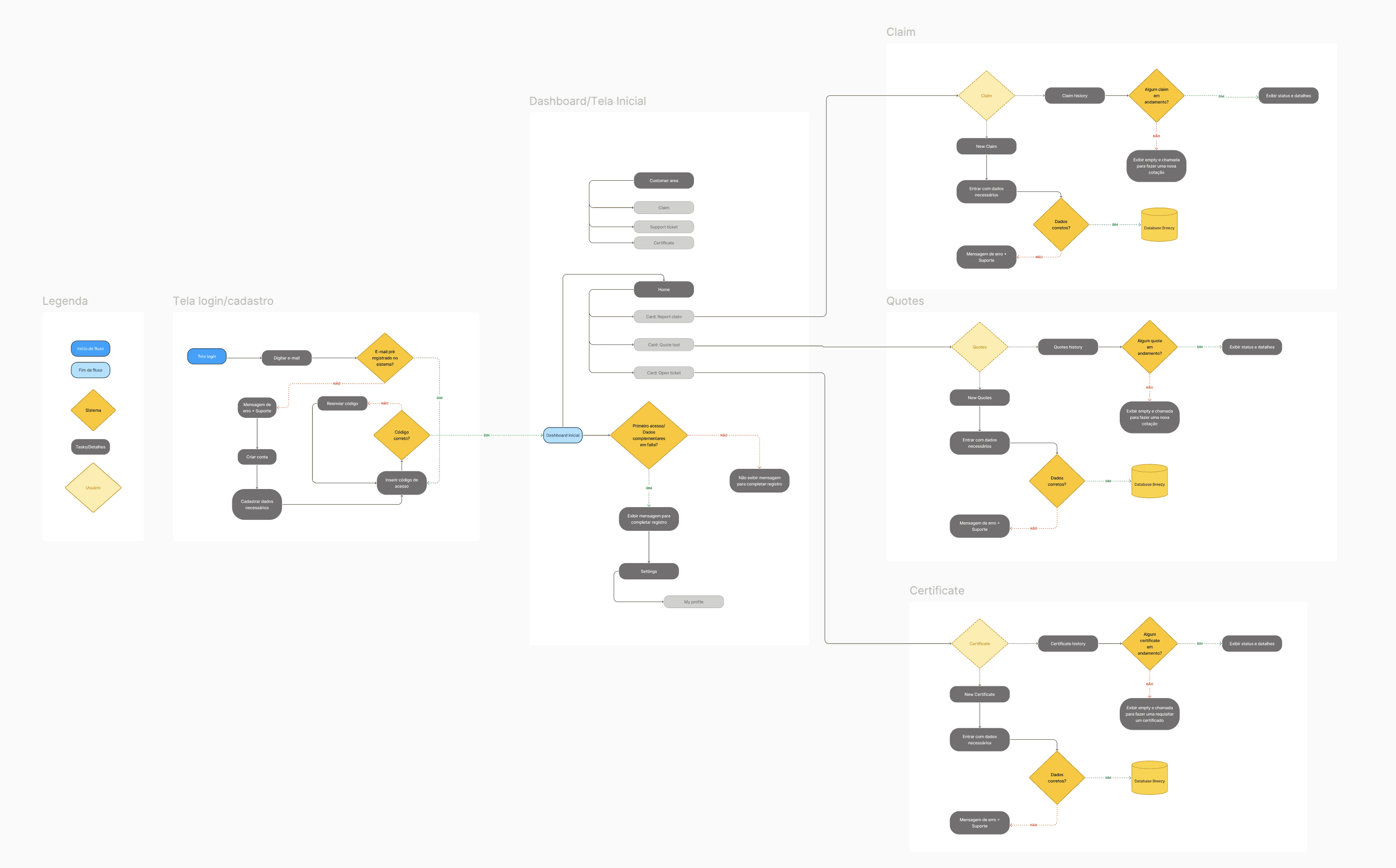
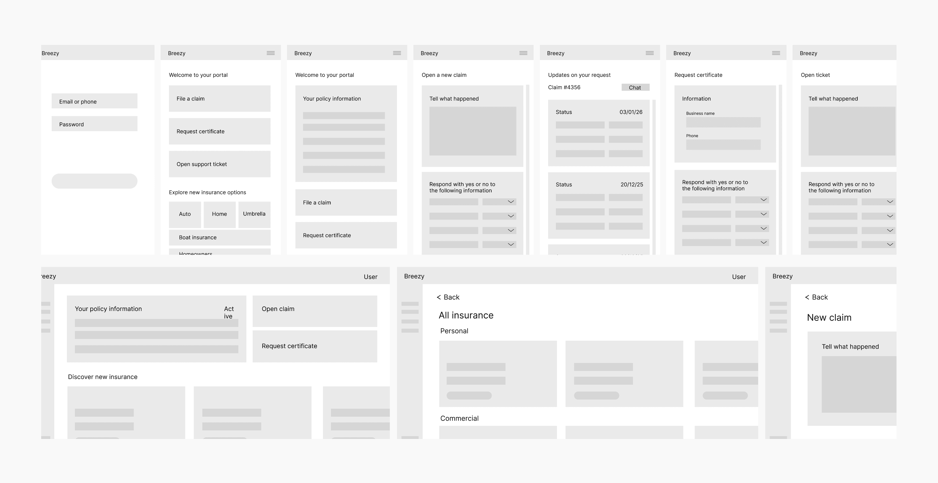
With the pain points and journey mapped, we designed the main customer flow for V1 of the portal, prioritizing immediate access to critical actions: filing a claim, issuing a certificate, and using a quote tool.

We created the first wireframes to quickly validate the structure and ideas before investing in a high-fidelity interface. We also used an MVP that had been put on hold to test some flows with the development team and understand what we could deliver to make V1 a good experience.
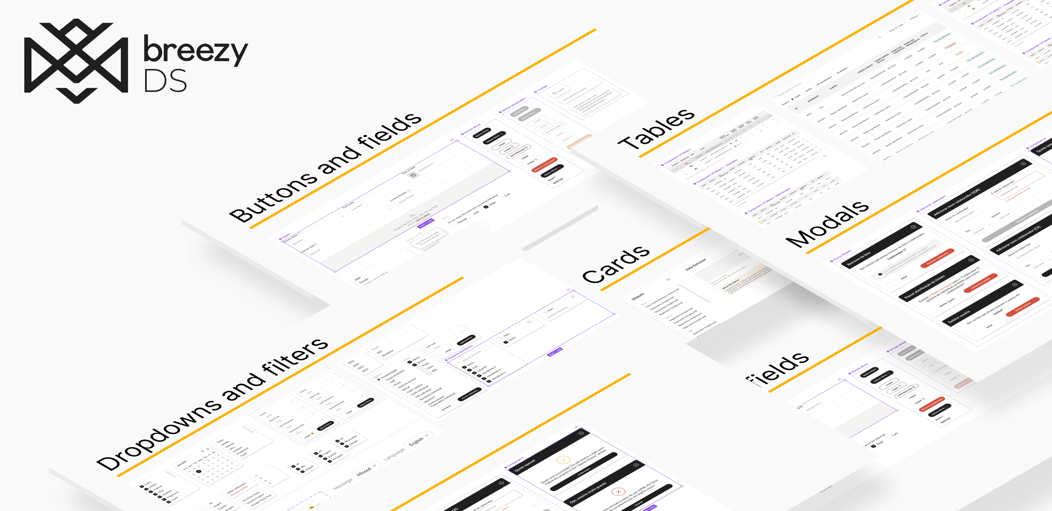
Early on, we built a foundation the project was missing: there was no Design System. Together with developers and stakeholders, we created a scalable foundation and started documenting everything from the beginning, building a living design system that we kept updating.
This was the project’s most valuable decision: it sped up development and ensured visual consistency in everything that followed, including cards, tables, and dashboards.
Tokens: standardized colors, typography, spacing, and icons
Reusable components: buttons, inputs, cards, tables, and dashboards
Accessibility and responsive design as required guidelines
Living documentation to help teams adopt the system
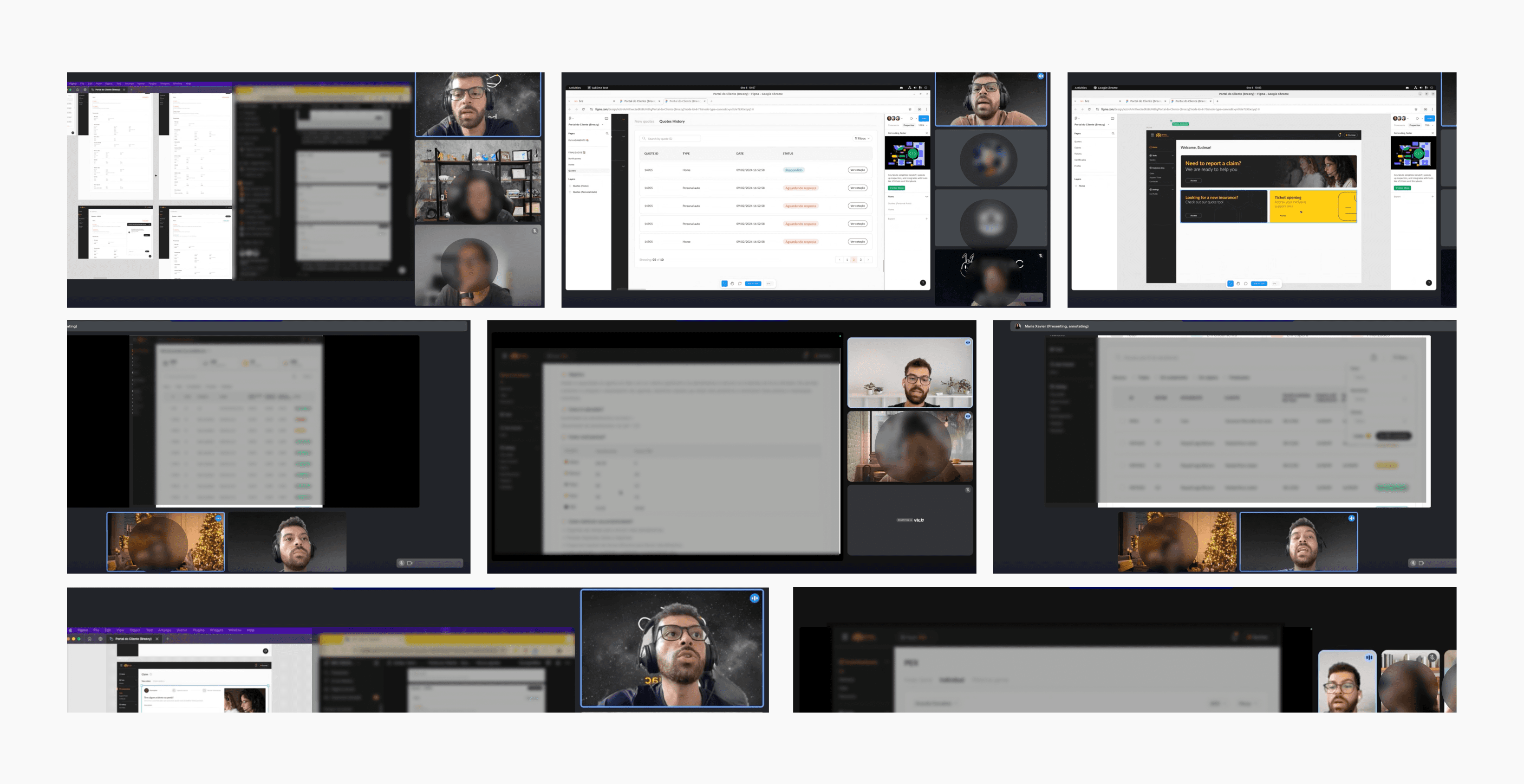
We ran several rounds of validation with stakeholders, developers, and some customers to check information and test flows before development. We adjusted what needed to change, especially data collection, which we made shorter and easier for customers.
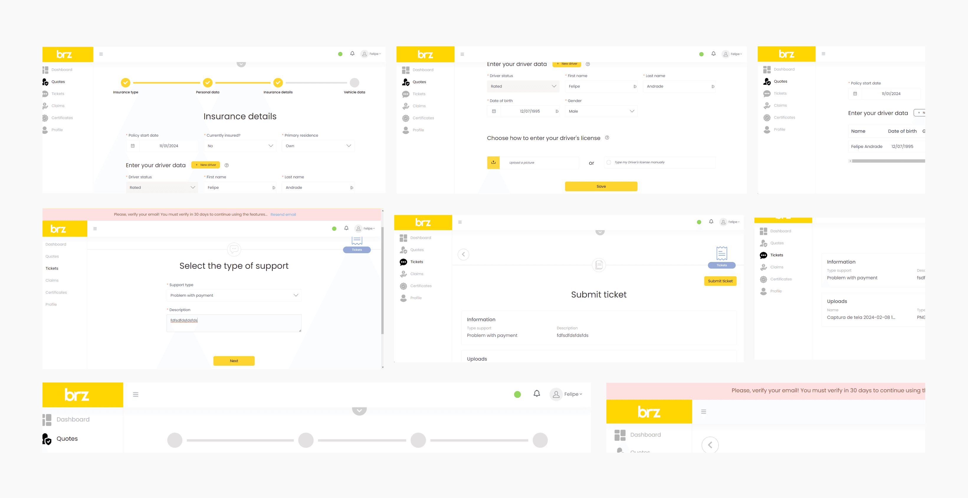
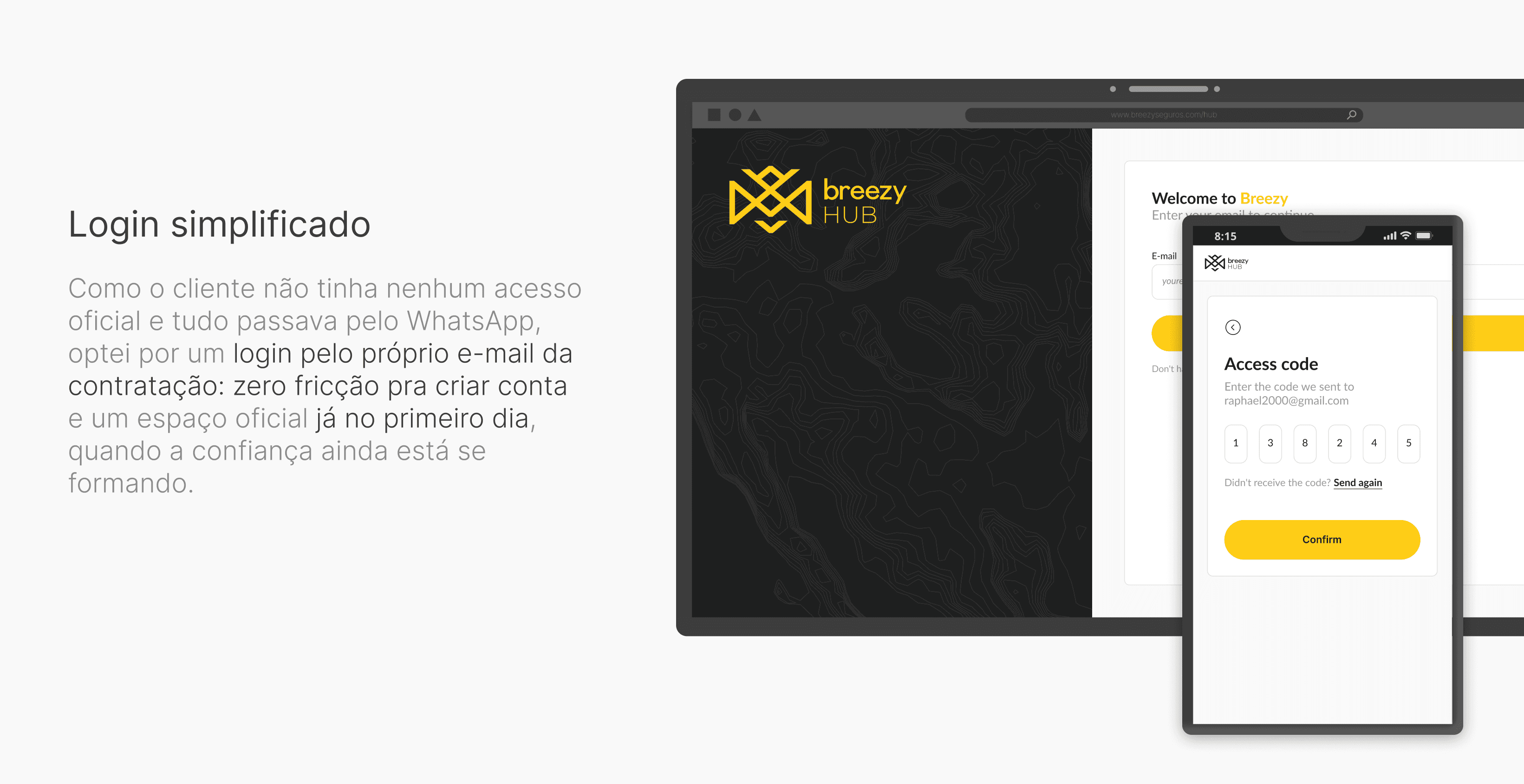
Simplified login using the email address provided when buying the policy
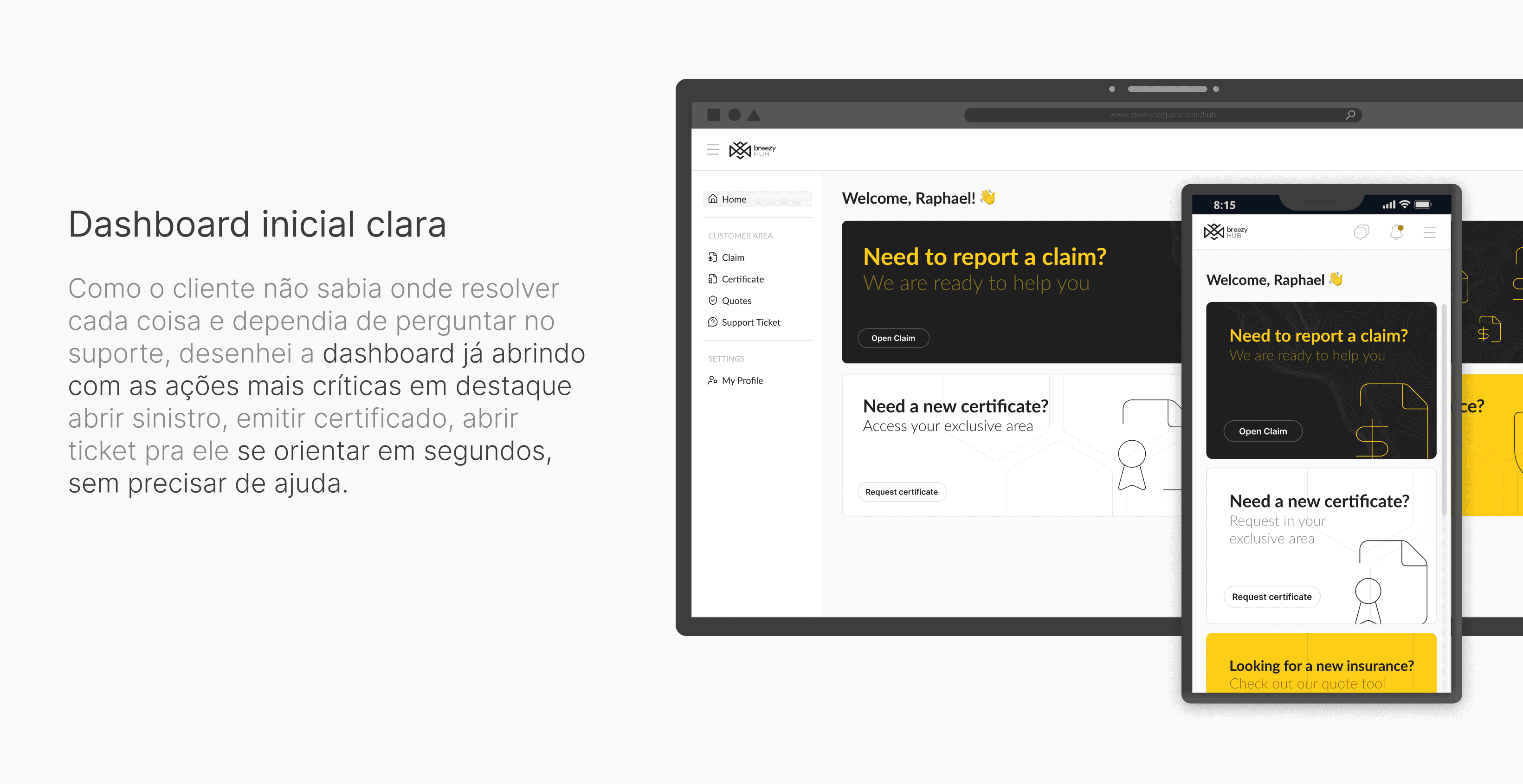
A clear landing dashboard with key actions immediately visible
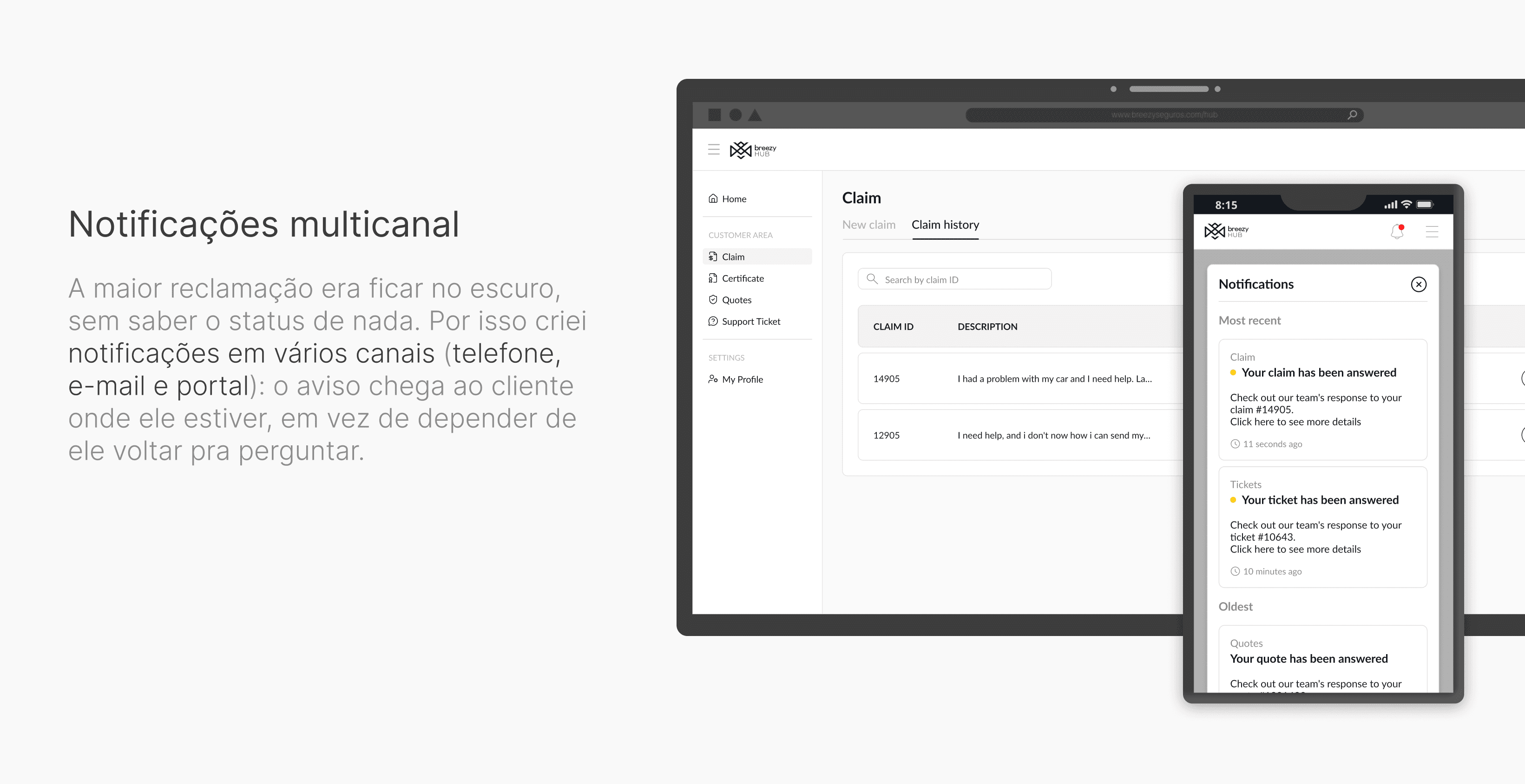
Multichannel notifications (phone, email, portal)
New insurance quotes integrated with the sales team
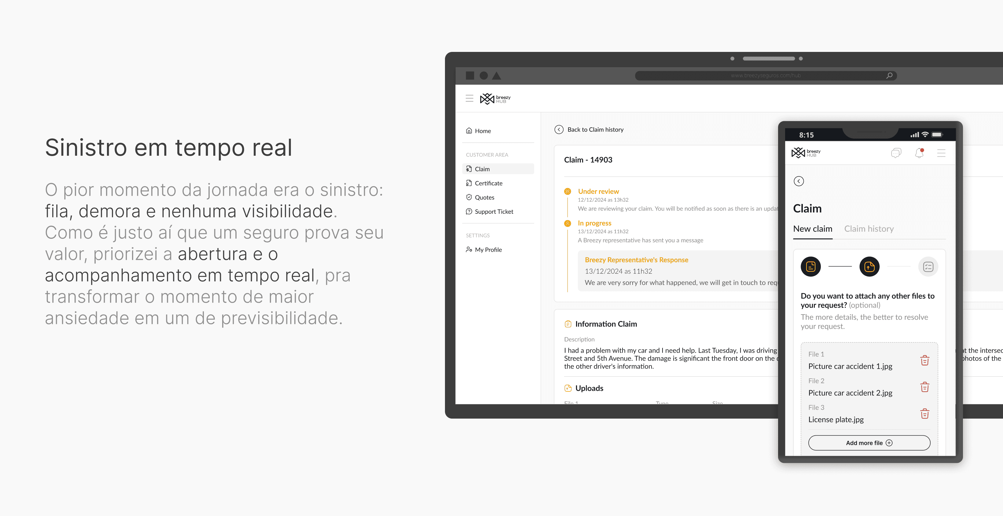
Claims with real-time tracking
Centralized support tickets
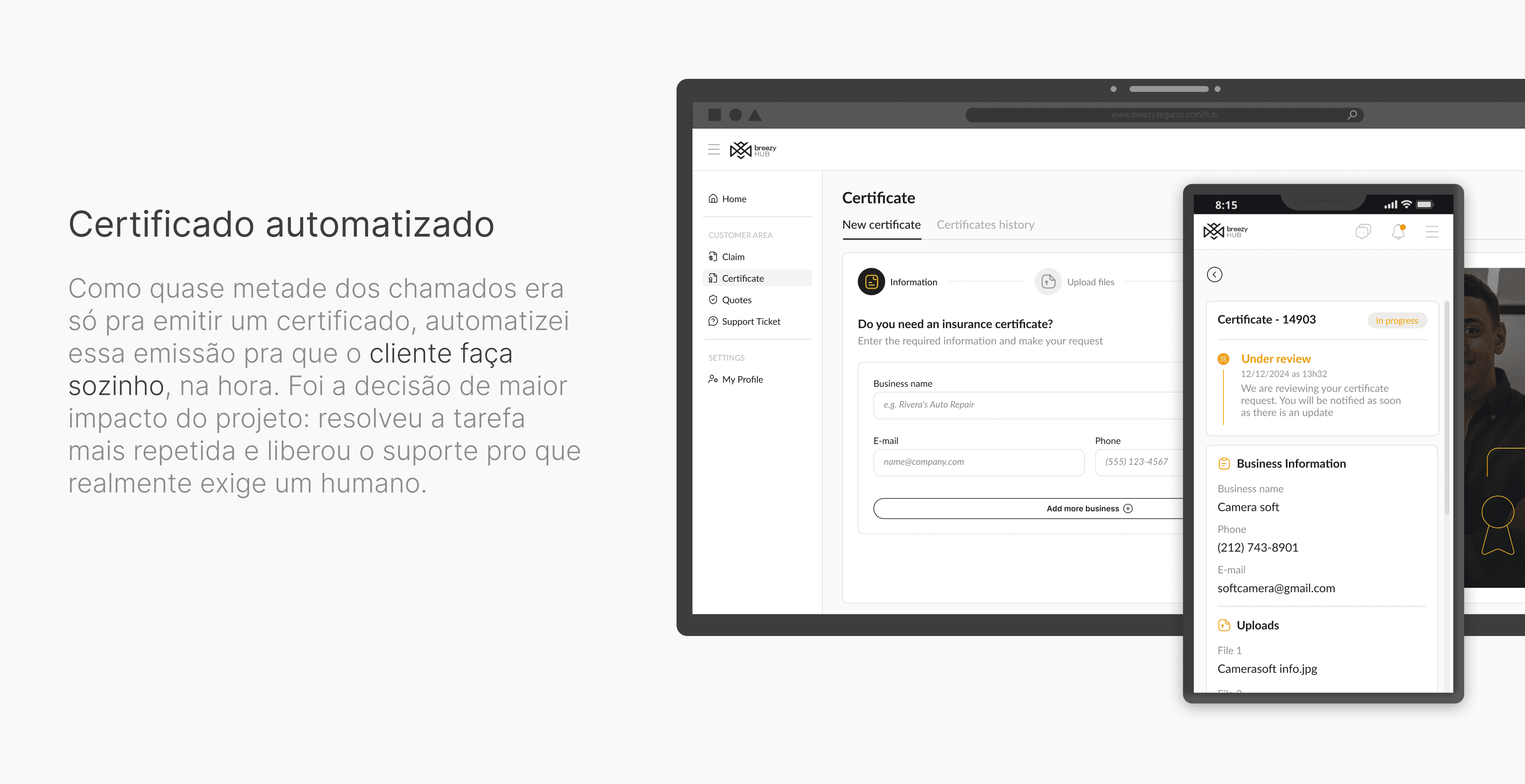
Automated certificate issuance without relying on CX
For customers: we expect to reduce the load on support, build trust and improve retention, and give customers control over requests that were previously handled manually.
For the business: a scalable product, a stronger digital culture, and a direct impact on operational efficiency and the customer experience.
Key learning: the biggest gain came from turning the most repetitive task, issuing a certificate, into self-service, rather than from a single feature. Solving the most common problem well freed up support for tasks that truly need a person.
Expand the portal with policy history and personalized offers (cross-sell), and increase the use of AI to proactively provide relevant information to customers.
Metrics to track:
Self-service rate (north star) — % of requests customers resolve on their own without contacting support.
Support ticket volume compared with the discovery baseline, with a focus on certificates.
Certificate issuance success: % of certificates customers issue on their own without errors or abandonment.
Portal adoption: % of active customers and migration from WhatsApp to the portal.
CSAT/CES in critical flows (claims and certificates)